
In order to understand branding, we first need to understand what a brand is. A brand, by definition, is a business and marketing concept that helps people identify a specific business, product, or individual. So, following that definition, branding is the process through which we provide meaning to the business, product, or individual.
When people talk about Branding, they talk about logos, colours, typography, etc., and try to contain Branding in that container. The term they are looking for is called “Visual Identity,” which we will explore later.
This leads to confusion among business owners as to what their brand is, and needless to say, it doesn’t help them stand out. So let’s find out ways your Branding can help you stand out.
Have a clear Message
Branding above everything is about the message you want the people to know when they talk about your brand. Effective Branding has a good message, and it doesn’t go one way or the other.
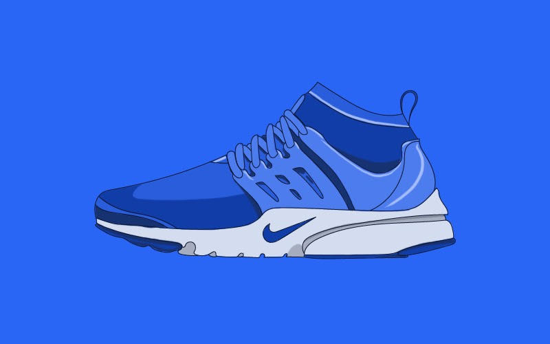
For example, if we look at a brand like Nike, their tagline says, “Just do it.” Everything from their products to marketing campaigns is at the cutting edge of what information and technology offer. If you notice, Nike is trying or, in some cases, has become more than just a sports brand to more of a household brand.
Their campaigns handle sensitive issues effectively while new campaigns with top athletes keep coming out. If it weren’t for their Branding, they wouldn’t be able to cover such a broad spectrum of issues and still stay clear to their message.
Have a Strong Visual Identity
Now comes the part of logos, typography, colour scheme, package design, and anything you can think of representing the brand visually. We won’t delve deep into visual identity, but you can check out this excellent article from 99designs.
Usually, when you design a brand’s visual identity, the biggest priority is that it must be “Memorable.” This is because your brand wouldn’t work if people forgot about it, so it must be memorable.
Two of the biggest mistakes that people make in this stage are that they forget to keep it simple, and they don’t think about their business and visual identity cohesively.
Looking at famous brands like Apple, Adidas, Pepsi, Coca Cola, these brands have kept their logos consistent and straightforward. As a result, decades later, people identify them instantly.
A great example of cohesiveness between business and visual identity is Ferrari. Yes, I’m talking about the RED car. It would be great if you realize what I just did there.
Enzo Ferrari, the founder of Ferrari, famously said
“Ask a child to draw a car, and certainly, he will draw it red.”
Red is a colour that stands for passion, love, anger, life, etc., and today the red colour is almost synonymous with Ferrari. Today, Ferrari represents people’s love for cars, their passion for motorsports, and many, their goal for life. So I think it’s safe to say they pulled off a branding masterstroke.

Understand Your Audience
Yeah, that’s the last tip. A business exists because there is a gap in the market and customer base that they can serve. So, isn’t it foolish to ignore them while crafting your messaging and brand overall?
An excellent example, in this case, is One Plus, the Chinese smartphone manufacturer. They knew their audience from day one, people who wanted to buy flagship phones but were put off by the price.
Evident by their tagline, “Never Settle,” it is clear that they understood their audience. They delivered a Flagship level phone each year in every way but the price. Their messaging was direct, and it connected.
These are my tips for you when you create your brand to stand out from the crowd and mean something more. Once you are clear with your messaging, start with a great design and build out your dream. Good luck!